

Introduction on responsive web design
what is Responsive web design is the approach to web development that makes sure websites offer an optimal viewing and interaction experience across a wide range of devices, from desktop computers to smartphones and tablets. It aims at a fluid user experience through dynamic layout and content adjustment regardless of screen size or resolution.
What is Responsive Web Design ?
what is Responsive Web Design is an approach that ensures that the design and functionality of a website adapt harmoniously to user behavior and environment, taking into account factors like screen size, platform, and orientation.
This approach combines flexible grids, layouts, images, and CSS media queries. As the user changes from a laptop to an iPad, the website should automatically adjust according to the resolution, image size, and scripting capabilities. The website should also take into consideration the device settings, such as the use of a VPN on an iPad, so that the website does not block access based on these preferences.
By making an effective use of technology, a website should answer the user dynamically, which actually eliminates the design and development cycle for each newly introduced device to the market.
Table of Contents
The Concept Of Responsive Web Design ?

The latest form of web development is known as Responsive Web Design (RWD), which adapts websites so that they suit various devices and different screen sizes and ensure optimal views and interactions regardless of whether viewed on a computer, tablet, or smartphone.
Flexibility is the core concept of responsive web design, with flexible grids, fluid layouts, and responsive images to change structure and content in different screen sizes. The main reason behind it is the usage of CSS media queries that apply styles according to specific characteristics such as width, height, or orientation of the device.
what is Responsive web design not only makes websites more user-friendly but also future-proof them by eliminating the need to create different versions for different devices. This approach prioritizes accessibility and user satisfaction while aligning with the ever-growing variety of devices in the digital landscape.
Adjusting Screen Resolution
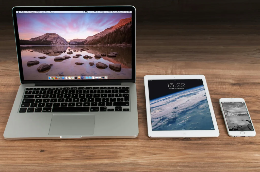
Let’s talk about what is responsive web design and how screen resolution becomes an important part in giving the best user experience. Responsive web design ensures that sites play well with all different screen sizes, resolutions, and devices on which the site is being accessed.
The layout adjusts according to the screen resolution for responsive web design. With the help of fluid grids, CSS media queries, and responsive images, the design dynamically adjusts and adapts well, ensuring it is beautiful across all devices – smartphones to big desktop monitors. Since it keeps the resolution of the screen in mind, responsive web design makes sure the content will scale without any distortion or misalignment.
In a nutshell, what is responsive web design? It is the approach that makes content adjust based on screen resolution and device so that browsing will be seamless on a variety of platforms and screen sizes.
Fluid Grids: Instead of using fixed pixel values for layout elements, responsive design uses percentage-based or relative units (such as em or rem) to allow elements to resize based on the screen size.
CSS Media Queries: Media queries enable web developers to apply different CSS rules based on the device’s screen resolution, width, height, or orientation.
For example, a media query can adjust the font size, layout, or hide certain elements when the screen resolution is smaller
@media (max-width: 768px) {
    .container {
        width: 100%;
        padding: 10px;
    }
}
Responsive Images: Responsive web design allows websites to have an optimal view across a variety of devices. What is responsive web design? It is an approach that includes responsive images, which automatically adjust their size and resolution to fit the screen they are being viewed on. This enhances performance and reduces load times while maintaining high-quality visuals for users, no matter the device they’re using.
Flexible Design Elements: The navigation menu, buttons, and containers may be designed flexible. That means they will resize or rearrange with the screen size or resolution so that it makes usability better for all devices.
Using these methods, web developers can create a website that not only looks nice but also operates well on the majority of available devices and resolutions, giving visitors an optimized viewing experience regardless of the device being used.
Custom Layout Structure
A custom layout structure is essential for making sure that your website is good-looking on all devices. But what does responsive web design mean? what is Responsive web design is the approach to developing a website in a way that lets it change its layout based on the user’s device to give an optimal view. With the use of flexible grids and images, responsive design provides a smooth experience across all devices.
While building a custom layout, it’s highly important to focus on responsiveness. This would mean designing a site that takes in the varied screen sizes that span from desktops to mobile phones, ensuring that all content is highly accessible through the application. What is responsive web design? It’s the foundation of modern, user-centric web design.
/* Default Style for a Website */

/* Resetting default browser styles */
* {
    margin: 0;
    padding: 0;
    box-sizing: border-box;
}

/* Body styles */
body {
    font-family: Arial, sans-serif;
    line-height: 1.6;
    background-color: #f4f4f4;
    color: #333;
}

/* Global link styling */
a {
    text-decoration: none;
    color: inherit;
}

/* Header styles */
header {
    background-color: #333;
    color: #fff;
    padding: 1rem;
    text-align: center;
}

/* Navigation styles */
nav {
    display: flex;
    justify-content: center;
    background-color: #444;
    padding: 1rem;
}

nav a {
    color: white;
    margin: 0 15px;
    font-size: 1.2rem;
}

nav a:hover {
    color: #f4f4f4;
}

/* Main content styles */
main {
    padding: 20px;
}

/* Footer styles */
footer {
    background-color: #333;
    color: white;
    text-align: center;
    padding: 1rem;
    position: fixed;
    bottom: 0;
    width: 100%;
}

/* Responsive Styles */
@media (max-width: 768px) {
    nav {
        flex-direction: column;
        align-items: center;
    }

    nav a {
        margin: 10px 0;
    }

    footer {
        position: relative;
    }
}
Conclusion of Responsive Web Design
what is Responsive web design now has mastered this aspect in the modern world: making sure that websites follow their audience to reach them on different devices or screen sizes. Responsive designs improve user experience and accessibility, as well as SEO performance, through the use of flexible grids and fluid images and media queries. With the continuous growth of mobile use, a business, and even developers, should never leave responsiveness outside along with fast-loading and engaging websites. Usability is better when you use responsive design, and not only that; it future-proofs your website for changing technology.
